Torrent details for "Helvetica 2007 1080p bluray YTS" Log in to bookmark
Controls:
×
Report Torrent
Please select a reason for reporting this torrent:
Your report will be reviewed by our moderation team.
×
Report Information
Loading report information...
This torrent has been reported 0 times.
Report Summary:
| User | Reason | Date |
|---|
Failed to load report information.
×
Success
Your report has been submitted successfully.
Checked by:
Category:
Language:
en
Total Size:
1.3 GB
Info Hash:
8E1DAF8AD8F8C2C53ED9B0073F87075EAAE0DEC0
Added By:
Added:
July 22, 2023, 6:31 p.m.
Stats:
|
(Last updated: May 22, 2025, 7:06 a.m.)
Genres:
| File | Size |
|---|---|
| Helvetica.2007.1080p.BluRay.x264.AAC-[YTS.MX].mp4 | 1.3 GB |
| www.YTS.MX.jpg | 52.0 KB |


Name
DL
Uploader
Size
S/L
Added
-
781.1 MB
[22
/
47]
2025-03-09
| Uploaded by CorsaroNero | Size 781.1 MB | Health [ 22 /47 ] | Added 2025-03-09 |
Title:
Genre:
Runtime:
1:20:00
Hours -
Rating:
7.2
Director:
Gary Hustwit
Cast:
Manfred Schulz, Massimo Vignelli, Rick Poynor…
Plot:
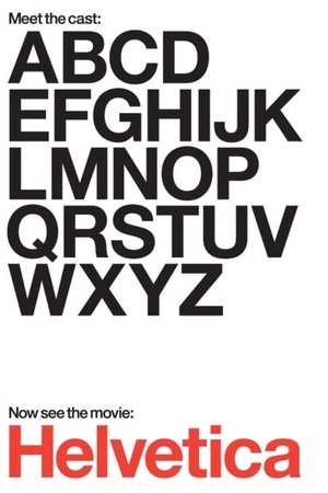
A documentary about typography, graphic design, and global visual culture.
Helvetica
IMDB - https://www.imdb.com/title/tt0847817
NOTE
SOURCE: Helvetica 2007 1080p bluray YTS
-----------------------------------------------------------------------------------
GENERAL INFO
Genre: Action, Documentary
Director: Gary Hustwit
Stars: Manfred Schulz, Massimo Vignelli, Rick Poynor
Plot: A documentary about typography, graphic design, and global visual culture.
Included subtitles
English
-----------------------------------------------------------------------------------
COVER
-----------------------------------------------------------------------------------
MEDIAINFO
The film opens with hand setting individual lead letters in a press, adding ink, then transferring them by pressing them against a paper. This process (using a Linotype machine) was used by early newspapers. Here it is used to produce a single word - the title 'Helvetica'.The documentary follows the typeface from its humble beginnings in a type foundry located in Münchenstein, Switzerland. Type designer Max Meidinger and his boss Edvard Hoffman were developing a new typeface which would be invisible, one which would not attract attention - one which would convey information but not draw attention away from the subject being discussed. The new typeface was named 'Die Neue Haas Grotesk'. In order to market the typeface to the American market a new name had to be chosen. The word Helvetia was chosen. Helvetia is the Latin name for Switzerland. But since there was resistance to naming the typeface after a country, so the letter 'c' was added and the word Helvetica was born.Since then it was adopted by stores, corporations, mass transit systems, and became the standard for anyone wanting to convey stability, transparency, and overall readability. Up until Helvetica's development in 1957, street signs, company logos and print advertisements used whatever lettering the designer drew. By switching to Helvetica the companies/stores gained instant credibility. Helvetica conveyed a clean, corporate look without standing out.The 70's changed typography as youth wanted to distance themselves from the establishment. Changing types was one way to accomplish that. Helvetica was seen as a 'slick' type used by the establishment to communicate. People stopped confusing legibility with communication. Combined with technological changes (computers), type faces became more democratic. No longer was identity limited to standard typefaces. The documentary wraps up by making the case that new typefaces continue to be developed to express what used to be the exclusive domain of Helvetica.


×